
COVID-19 Research
Part 1: Excess Deaths Associated with COVID-19: County Level
This map shows excess deaths associated with COVID-19 by county. These values represent actual COVID-19 deaths divided by the expected deaths by today's date in a typical year*. The values are calculated as D/dRP for each county, where D is the number of COVID-19 deaths, R is the average age-adjusted death rate for the three most recent years of available data (2016, 2017, and 2018), P is the 2018 population, and d is the fraction of the year completed (e.g. August 20th = 232/366). Data sources: New York Times county-level COVID-19 API, CDC/NCHS, and U.S. Census ACS.
For more on excess deaths: CDC Excess Deaths Dashboard (state level). For risk calculation by county: COVID-19 Risk Assessment Tool Map. Thanks to Joshua Weitz and Jennifer Glick for their assistance. Ref: Lee, S., Andris, C. (2020), “Excess Deaths Associated with COVID-19: County Level.” Friendly Cities Lab Technical Report, Georgia Institute of Technology. Accessed online: friendlycities.gatech.edu/covid19.
*The data and companion date of the year is updated each Monday (latest date: Aug. 9, 2021).
Part 2: Movement and COVID-19
Lee, S., Liang, X., and Andris, C. (2020), "COVID-19 Behavioral Responses." Friendly Cities Lab Technical Report, Georgia Institute of Technology. Accessed online: friendlycities.gatech.edu/covid19.
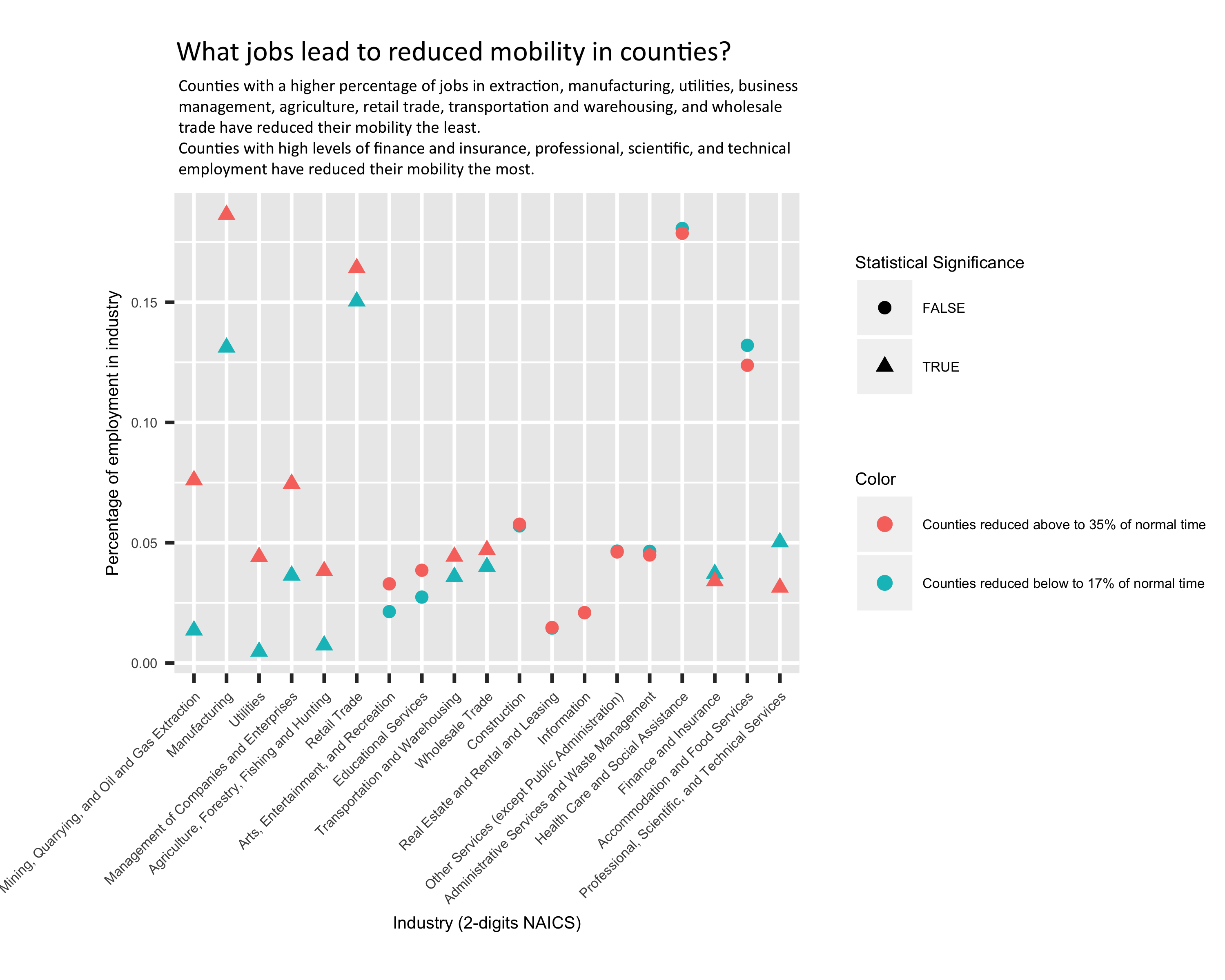
QUESTION 1: What kinds of jobs/industries are associated with more movement or less movement? Counties with extraction, manufacturing, utilities, business management, agriculture, retail trade, transportation and warehousing, and wholesale trade have reduced their mobility the least. Counties with high levels of finance and insurance, professional, scientific and technical employment have reduced their mobility the most.
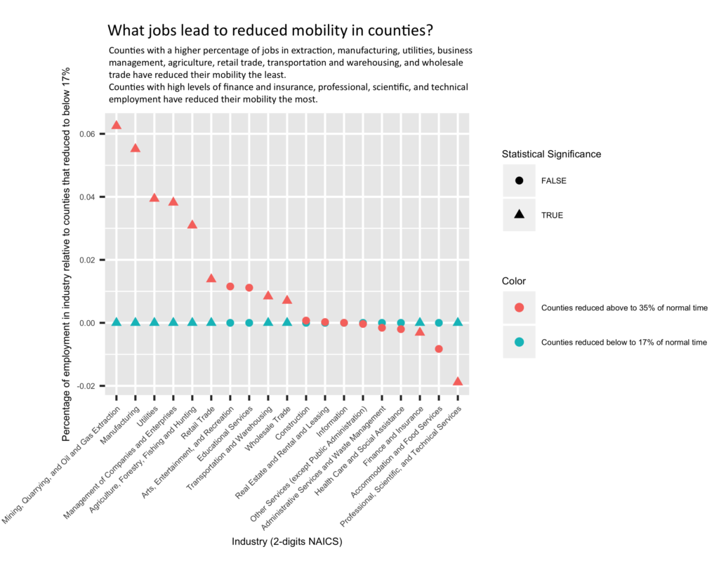

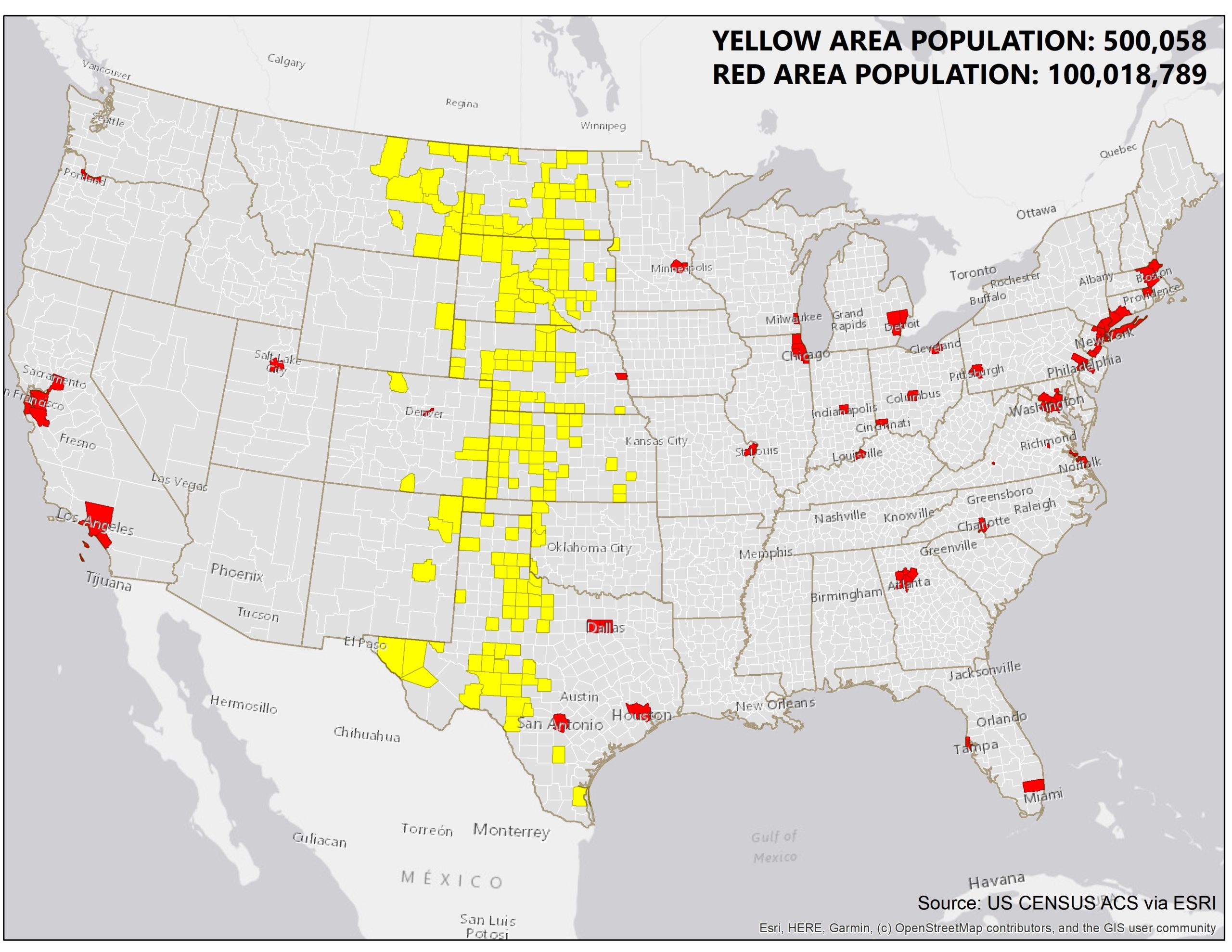
Mobility data from: Descartes Labs 'M50' mobility index, representing the change in the median distance people in a county are traveling (top 10% of anomalies removed). Job data from: county-level NAICS codes (types of jobs people have). Counties sectioned by top 25% and bottom 25% quantile; Top counties (n = 502) reduced their mobility <17% of typical mobility rates and bottom counties (n = 501) reduced mobility >35% of typical rates. We only account for counties with shelter-in-place (by 4/3/20). Mobility data accounts for weekdays from the start of the order to 4/10 so all counties can react to the order. Results are not sensitive to the percentage of residents working outside their home county, which is 50% for both groups via commuter data. Below is a map defining the counties used.

QUESTION 2: Which locales have increased their time spent at home and decreased their mobility? Countries in Europe that have been hit hard by the virus increased their time spent at home, and significantly decreased their patronage of retail and recreational places. States in the U.S. have decreased their retail and recreation visits to some extent, and stay home roughly 10-15% more often (with outliers in either direction).
Trip data is from Google's PDFs (inc. retail, grocery stores, parks, home, jobs, etc.) via Vitor Baptista. Deaths are from USAFacts and European Centre for Disease Prevention and Control (ECDC) (3/29/20). (Download the GIS data at US county level here).
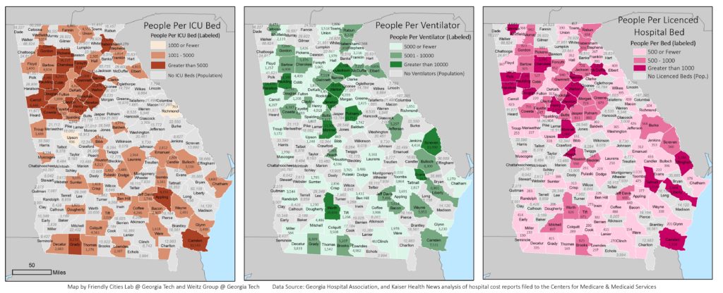
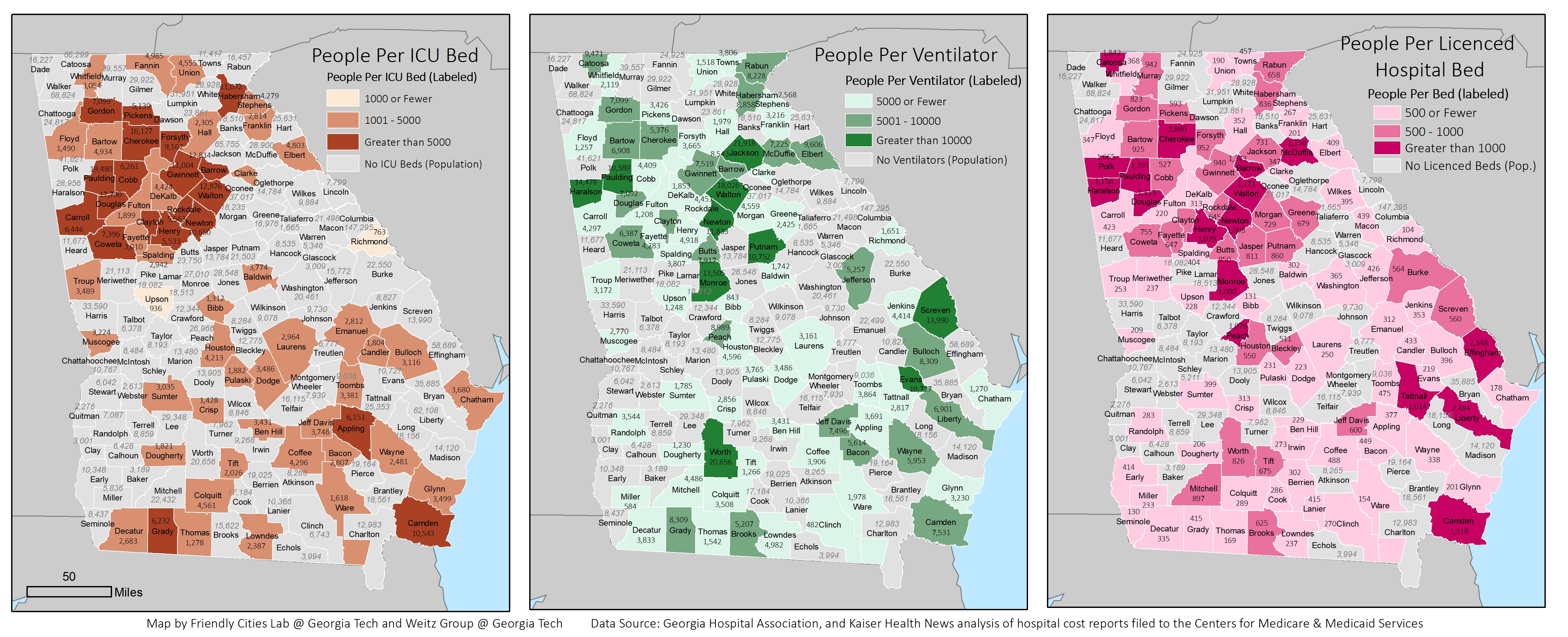
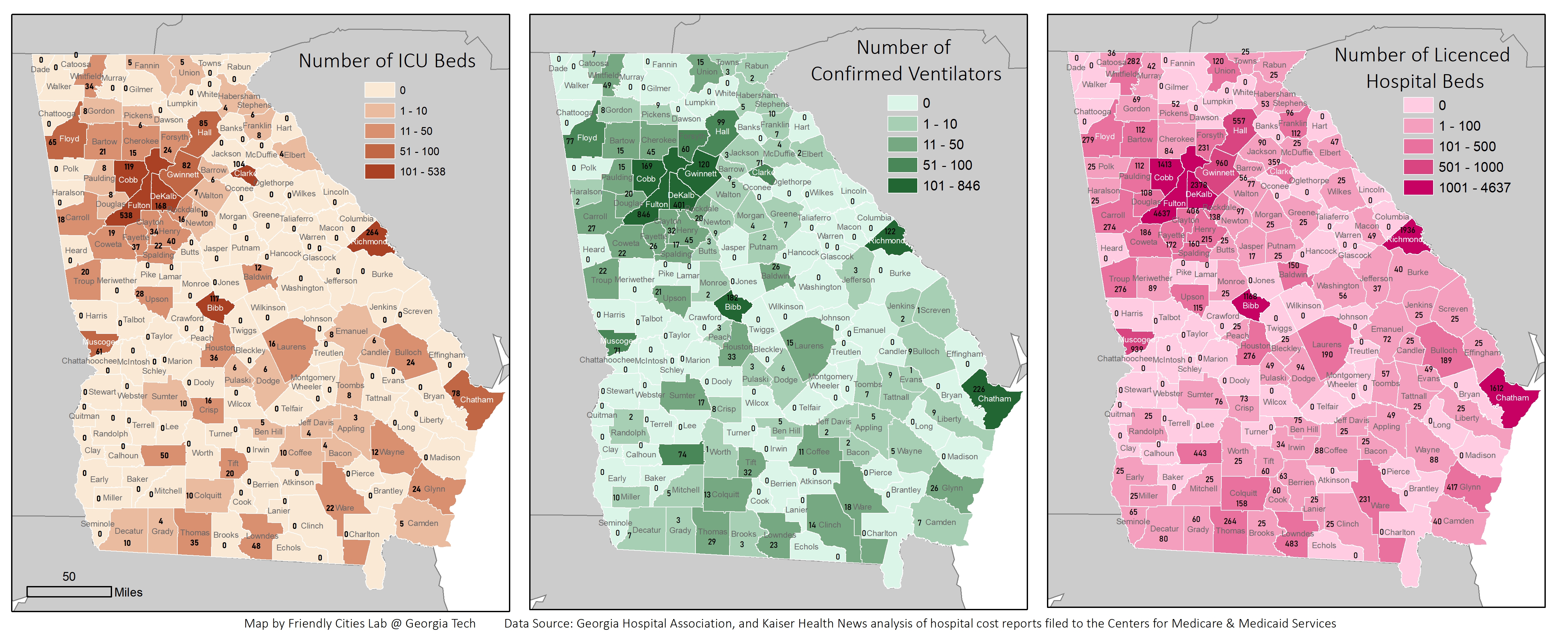
QUESTION 3: Which counties have sufficient ventilators and hospital beds per capita?

For real-time updates see dashboards from GIS analysts from U Chicago, Penn State, U Wisconsin.